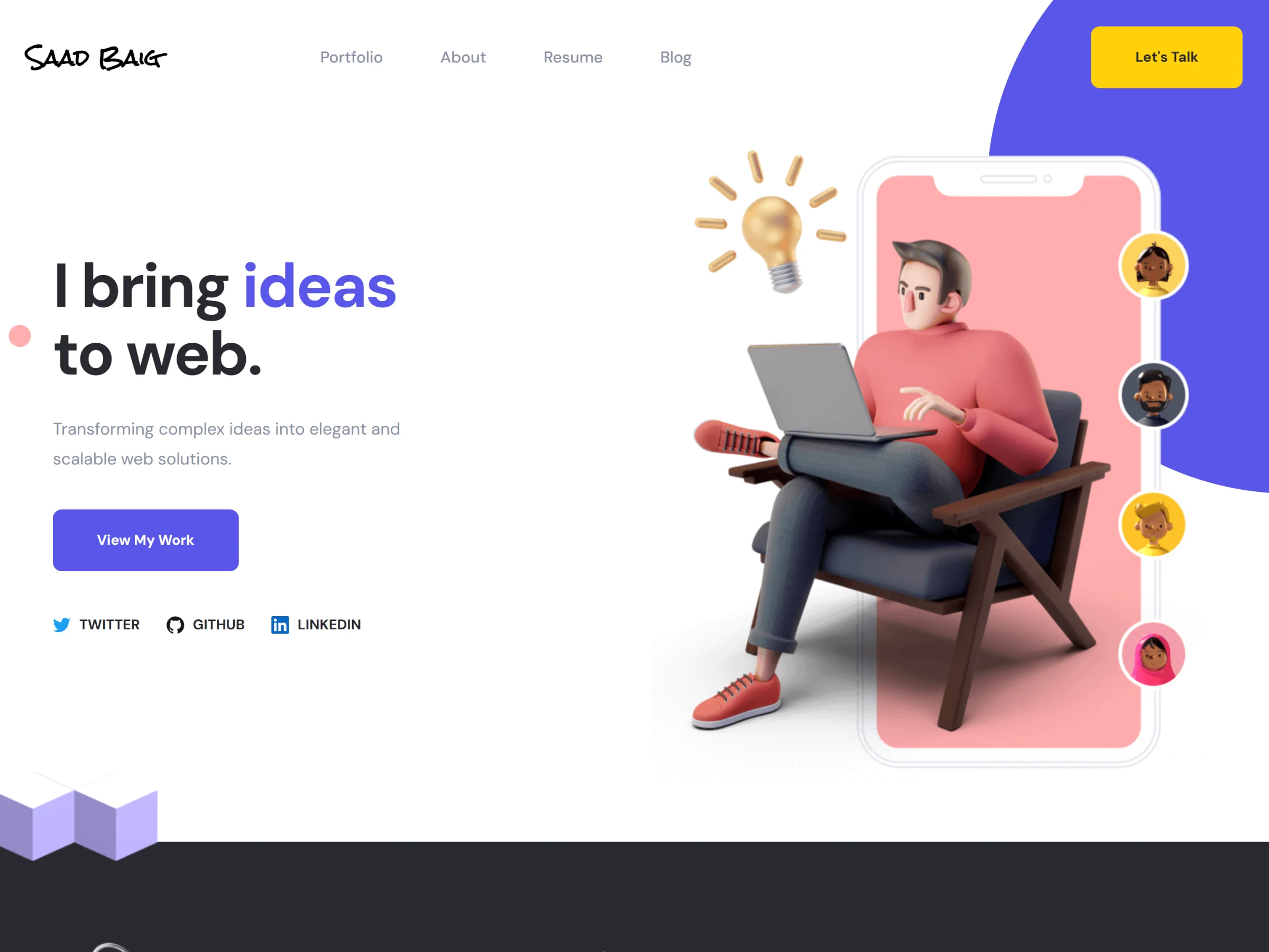
Why I built it
In 2023, I needed one place to send clients and employers: who I am, what I can do, the work I had shipped and what I was writing about. I wanted it to look like something I would be happy to build for a client, so I designed it and built it myself.
What is on it
A home page that runs as one long story: hero, skills, selected work, about, resume, recent posts and a contact form.
A portfolio page and a page for each project, with a screenshot viewer and a written case study.
A blog with a profile card and recent posts in the sidebar, and a page for each post.
A sitemap generated from the same content, so new posts and projects are indexed without extra work.
The look
The palette is small on purpose: a deep violet for actions, a warm yellow for highlights, and a near-black for the sections that need weight. Headlines are large and short. A hand-drawn wordmark sits top left, and 3D illustrations carry the personality so the copy can stay plain.
Small pieces of motion keep the page alive without getting in the way. Shapes drift slowly around the hero, rings orbit behind the About and Blog sections, key words get an animated underline, and project cards reveal their details on hover.
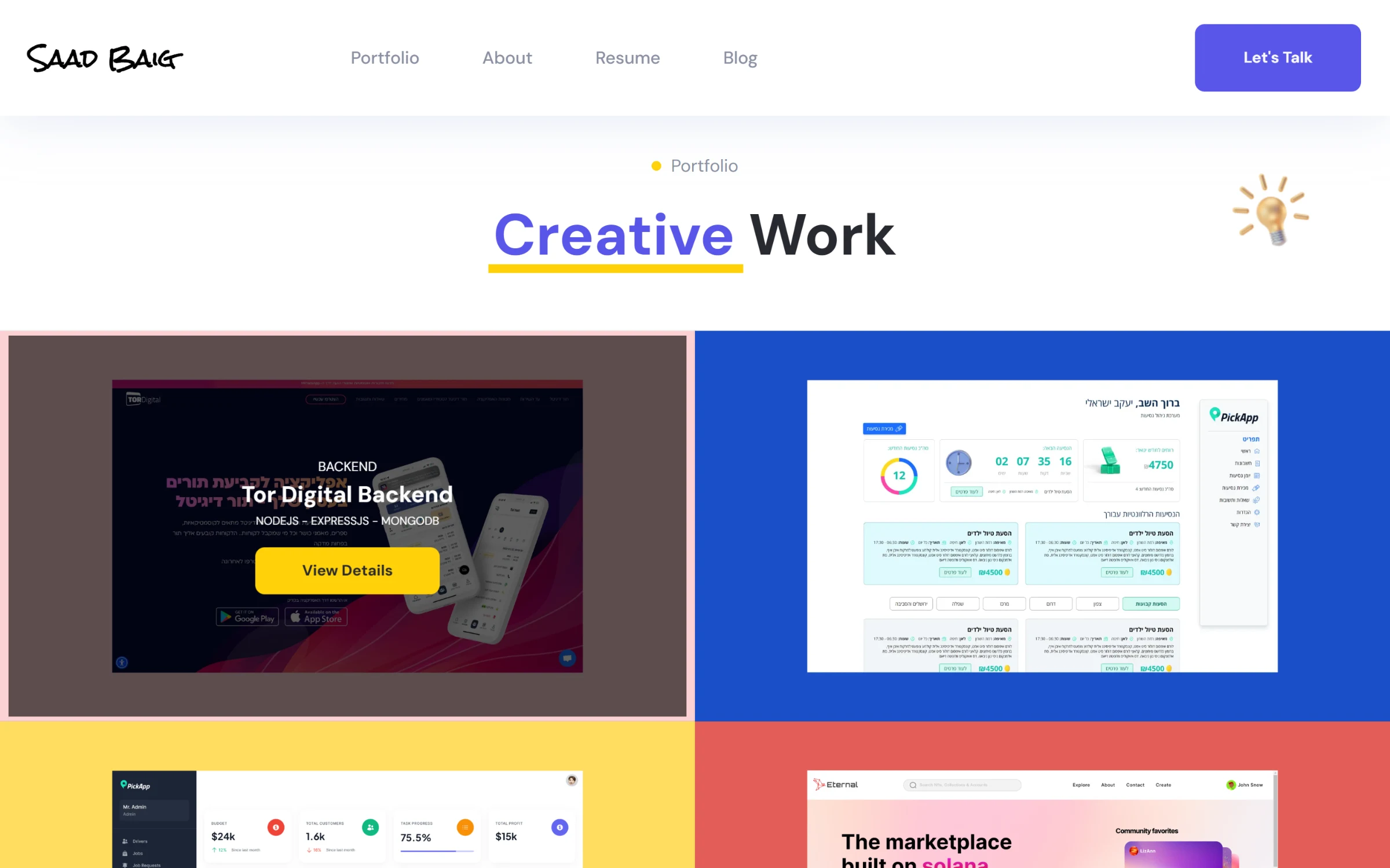
Selected work. Hovering a card dims the screenshot and shows the project name, stack and a link.
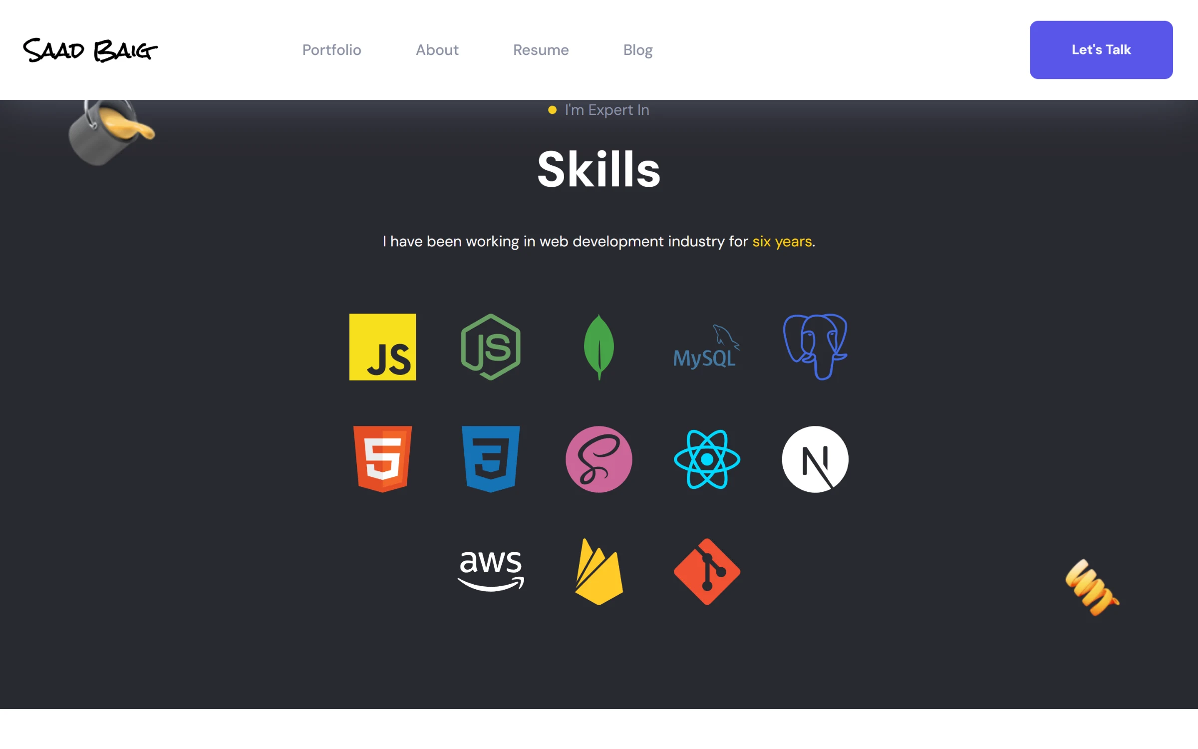
The Skills section, one of the dark bands that break up the page.
A header that changes as you scroll
At the top of the page the header sits on the hero with a yellow call to action, against the violet shape in the corner. Once you scroll past the hero, a second, solid header slides in and stays pinned, with the button switched to violet so it still stands out on white.
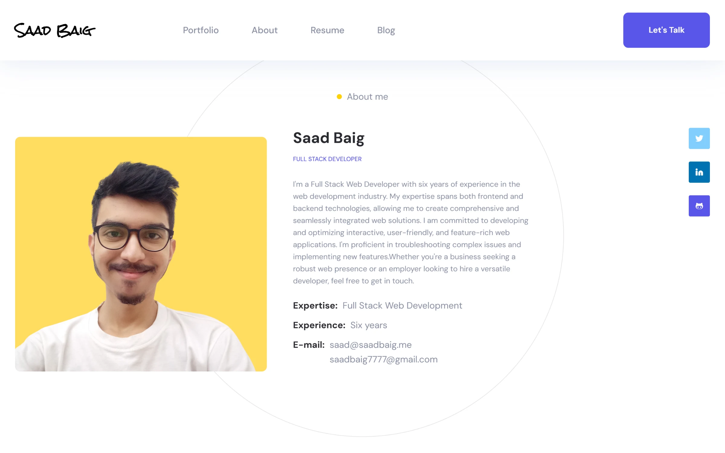
The About section, under the pinned header.
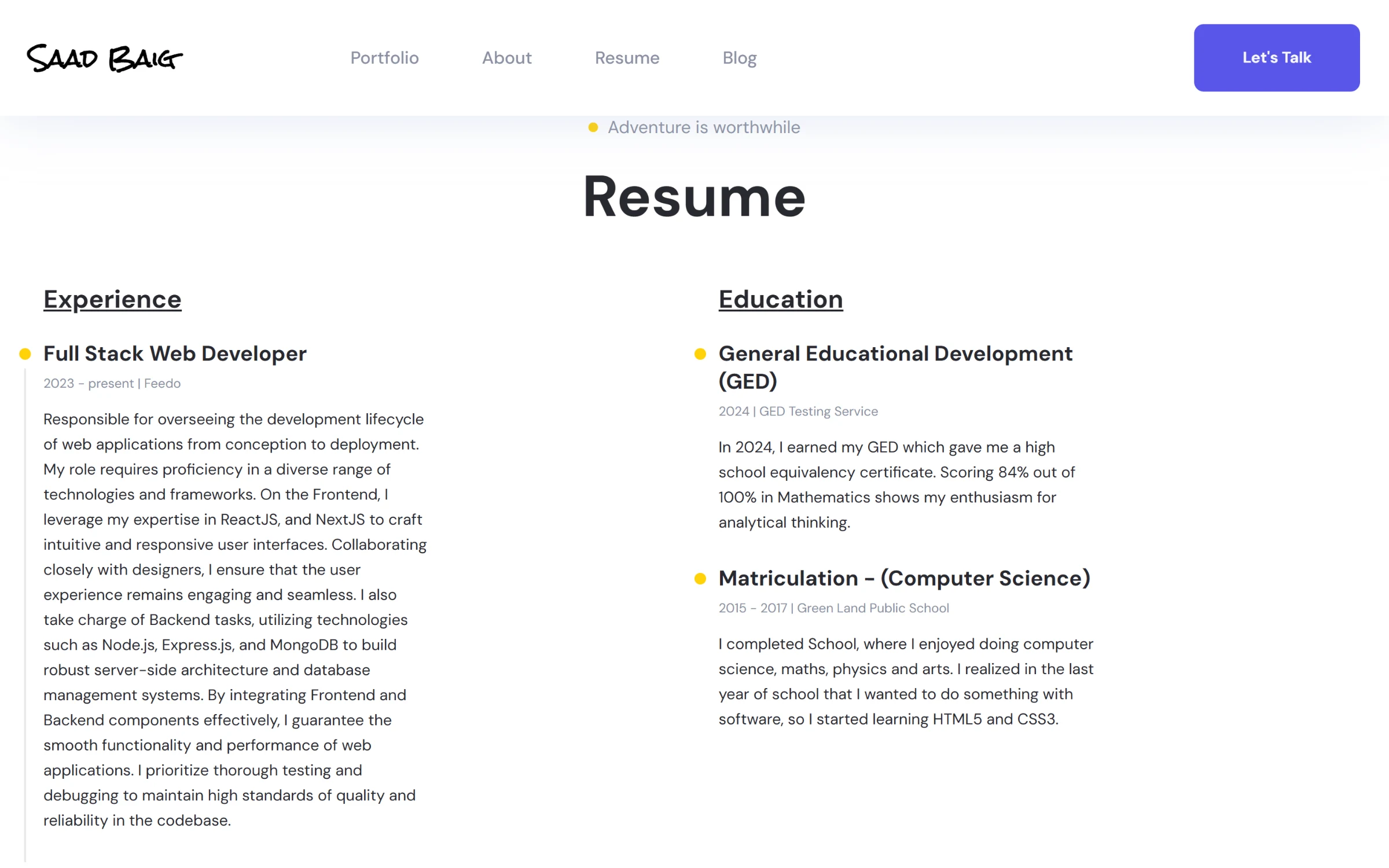
The resume as two timelines.
Content without touching code
Projects, blog posts and testimonials live in Contentful. Next.js fetches them at build time, so every page is static HTML and loads quickly, and adding a project or a post is a CMS edit. Project pages switch between a screenshot viewer and a case study written in Markdown. The testimonial slider shows what clients wrote about working with me.
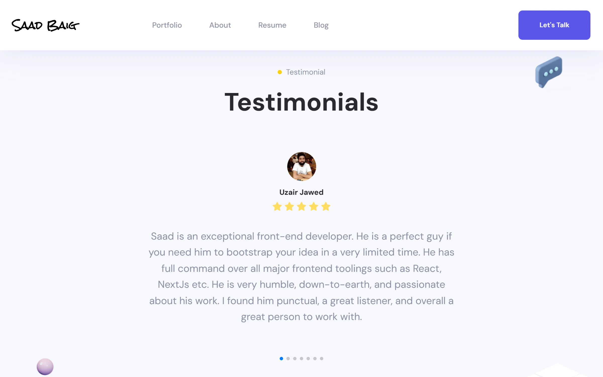
Testimonials from clients, one per slide.
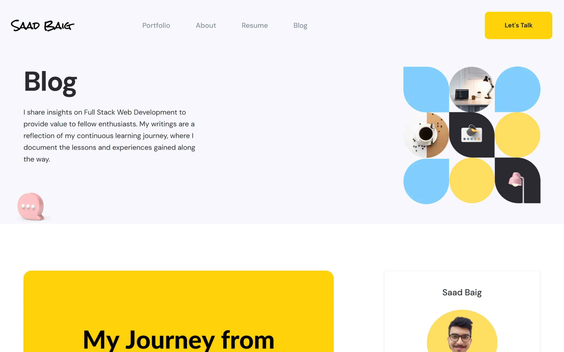
The blog index, with the posts I wrote.
Mobile
Every section has its own mobile layout. The navigation folds into a full-screen yellow menu, the hero stacks with the illustration under the copy, and the skills grid drops to three columns.
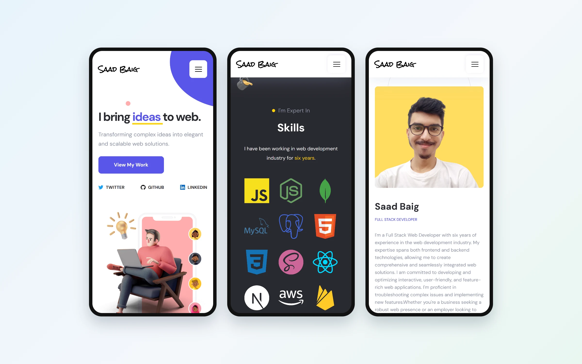
The hero, skills and About on a phone.